PERSONAL PROJECT
Chess.com mobile app
User Experience and User Interface Design
How might we ensure that users of the chess.com mobile app can conveniently and intuitively access the primary features of the app?
This was a personal project, initiated after rediscovering my love for chess while playing against my housemates during the covid lockdowns. After transitioning from nightly games on the board, to multiple games per day on mobile, I noticed that the chess.com mobile app was much harder to use in comparison to the website version, even though they were almost identical in terms of features. Despite using the app religiously, I had trouble navigating through it, often clicking the wrong button or going to the wrong page. After observing that other people also experienced issues with the app, I pursued this redesign as an opportunity to improve the experience in any way I could.
Through usability testing, I discovered that many users struggled with navigation within the app to find relevant features that they wanted to use. Based on my research findings, I designed some solutions and validated them further with additional usability tests.
whats the problem?
My original problem statement was that Chess.com mobile app users were overwhelmed when browsing through the features of the app, due to the excessive content and poorly designed navigation systems.
As a user of this app, I was regularly getting lost in the navigation menus, with many of the options being confusing, unclear or just misleading. I believe that other people would also experience these issues, and that solving them would improve the overall functionality of the app.
The problem statement evolved throughout the UX process, with my solutions being more focused on guiding users towards their primary desired features, as opposed to supporting and encouraging them to browse through all (secondary) features.
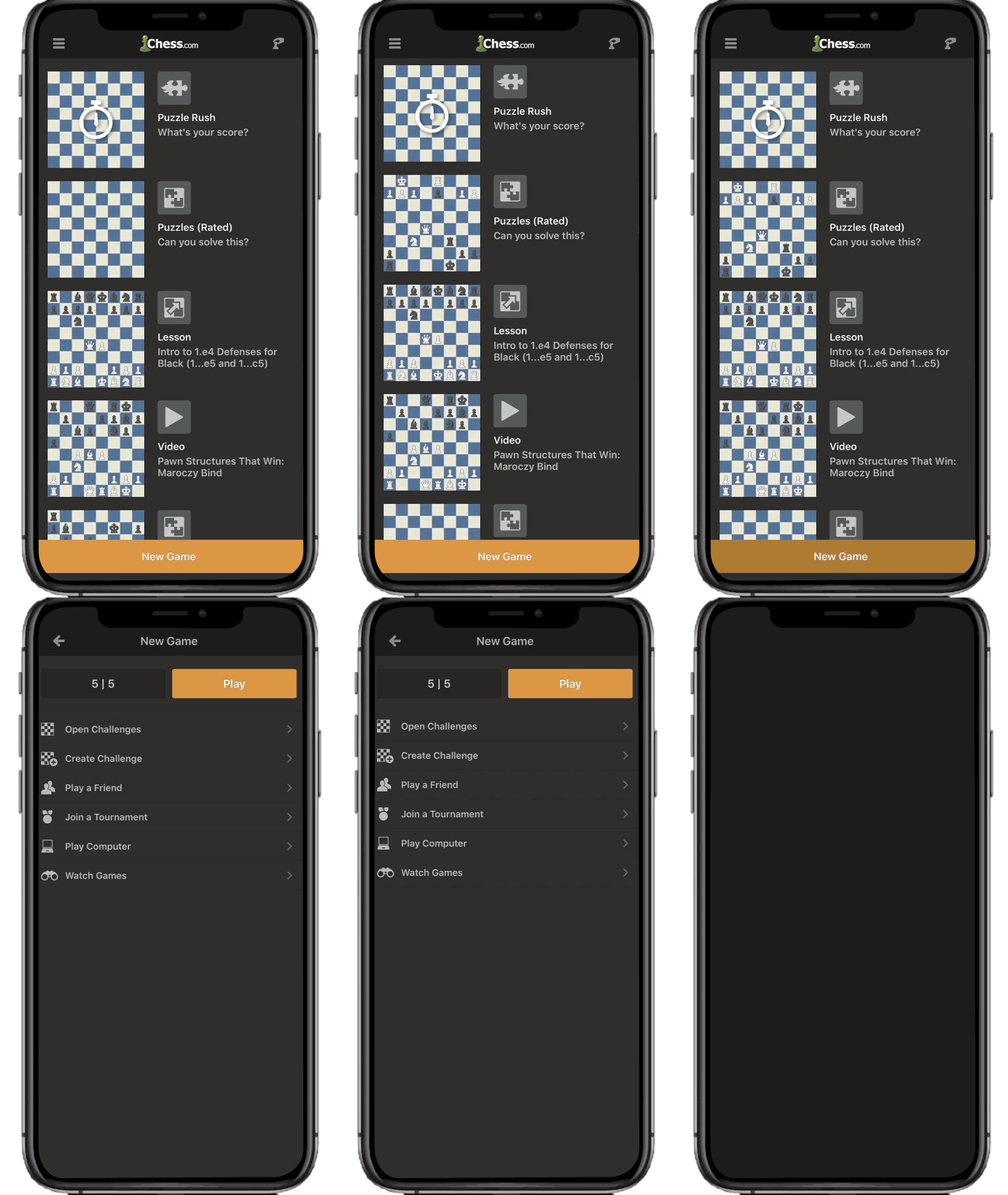
Before
The original product has poorly designed navigation, menu systems, and informational architecture result in an experience that users describe as “confusing, misleading and difficult to navigate.”
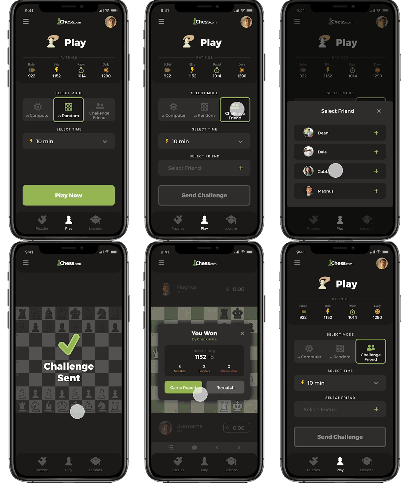
After
My proposed solution introduces simple navigation systems and clearly identifiable components to create an experience that users have verified to be “intuitive and easy to use” through benchmark testing.
About Chess.com
Chess.com is an internet chess platform, forum and social networking website launched in 2007. According to Alexa Internet rankings, the site ranks as #277 in US internet traffic and engagement (June 12, 2020), which is far more popular than any direct competitor. The website has many features including various online chess modes, puzzles, lessons, blogs, forums and much more.
The mobile app version of chess.com was released in 2009, and currently features almost all of the functionality offered on the website.
Business Goals:
The first step was to identify and define the business goals of chess.com. Through desktop research on the founders and lead developers, I was able to uncover the 3 core values of the business; to provide users with a joyful experience playing online chess, a safe and respecful community environment, and a place where users can learn, grow and experiement with lessons and puzzles.
“We imagined a site where people could build their chess home online and all in one place: to play in a safe and friendly environment, find friends, save their games, tell their chess stories, share ideas, and learn from each other.”
ERIK ALLEBEST - CHESS.COM FOUNDER
UX Research
Competitor Analysis
The next step was to conduct research to identify the primary user needs, starting with brand analysis of some direct competitors, and other popular iOS games. It was clear that the most popular competitors were designed in a way that was intuative, easy to navigate, and required very little effort to access primary features.
Online Survey
Next, I conducted an online survey to further understand user needs and desires. Out of all 33 participants, 28 had experience playing chess, of which 16 were active chess players, who mostly play online.
Participants were asked a number of questions, one of which was to score a range of apps, including compeitors in terms of how usable they would determine the app upon first impression. The chess.com mobile app scored the lowest of all options.
Participants were also asked about what features of a chess app they would consider the most valuable, results showed that all particpants consider ‘play’ features to be most valuable. Regular users consider the next most valuable feature to be ‘puzzles’, whereas new users prefer the ‘lessons’ feature.
One-on-one interviews
Following the survey findings, 6 one-on-one interviews were conducted on participants represening the 3 key proto-personas of new, casual and experience chess.com app user. The primary objective of the interviews was to dig deeper into the expectations and desires of the chess app users, to analyse users innitial impressions the app, and to observe users performing basic tasks on the app, while taking note of their thoughts and feelings to identify painpoints and oportunities for improvement.
Developing Insights
Findings from interviews and surveys
An affinity map was created to cluster consistent data points from all prior research, and to identify correlating factors that needed to be addressed.
Insights
Insight #1
Key features should be easily accessible
When asked 'how the app might be improved', the most common answer was that the app should be designed around primary features so that they are quickly and easily accessible upon opening the app. A common suggestion was to introduce a 'quick play' feature, that would allow users to start a game in 1-3 clicks, based on their favourite/most recent game settings.
My original hypothesis was that users want to browse through the app with ease, discovering new features without getting lost, however this insight showed that what users really want is quick access to 1-3 main features.
Insight #2
All users consider 'Play Now' to be the most valuable feature
Further to insight above, all users consider the 'play now' feature to be the most valuable feature of the app. More specifically, new users consider 'play a friend' to be the primary feature, wheras regular and casual users consdier 'challenge a random/stranger' to be the primary feature.
Insight #3
Different types of users value different (secondary) features
Although i was expecting a diference in the ways that diferent types of users (new vs experienced) interact with the app based on familiarity and experience, it was an interesting insight to see a distinct diference in what features they expect the app to offer. Along with the play features mentioned in earlier insights, new users want easy access to the lessons page, whereas experienced users want quick access to puzzles.
Insight #4
Design and content should be clean and simple
Overall, there was not much positive feedback on the apps visual design, layouts, and page content. Even experienced users consider some button labels to be misleading or unclear, and new users found that much of the content on pages (especially the home page) was confusing and had no meaning. More specifically, the large chess board graphics repeated on the home page for each of the game modes recieved alot of poor feedback as the boards all looked the same, and gave no context to the game modes. Also the scale of these graphics was dominating, and did not align with the functional hierarchy of the page, as many new users were so distracted with these graphics that they complely overlooked the 'new game' button.
Users also considered the overall styling of the app to be "not very attractive", with too many unclear visual elements creating an overwhelming experience. The general lack of hierarchy and inconsistent design between pages made it difficult for users to intuitively perform simple tasks.
Developing personas
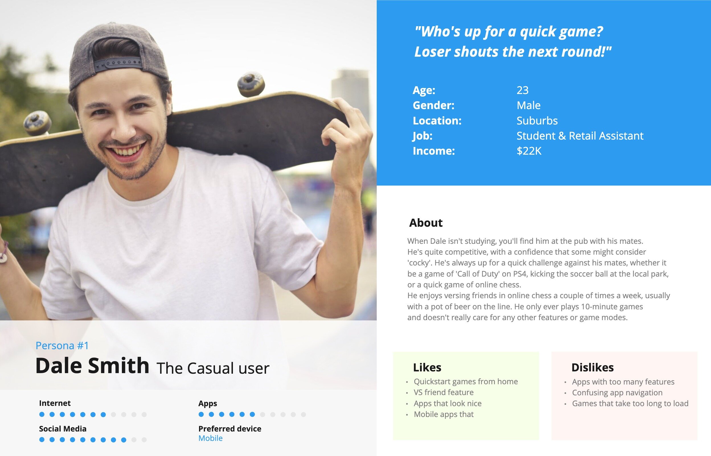
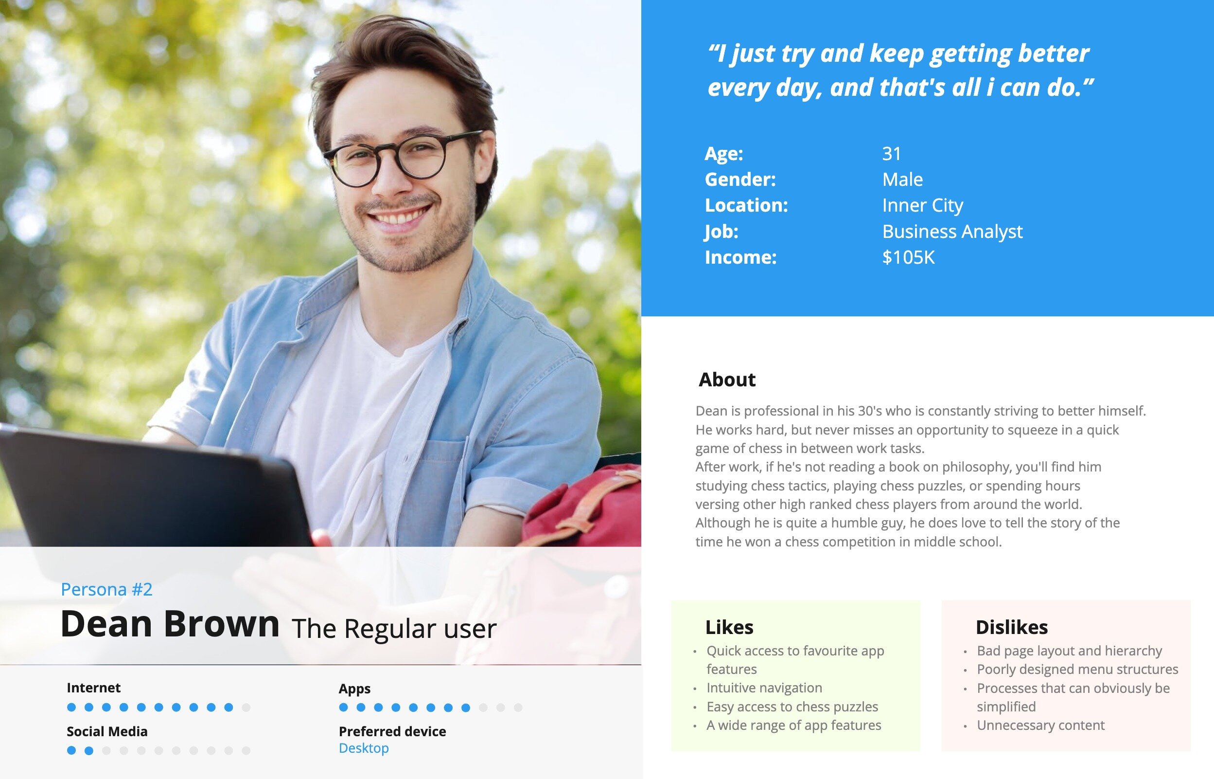
Based on the information gathered in the research phase, the 3 earlier formed proto-personas were developed to clearly represent the primary users of the app, and to ensure my solution would cater to all needs. The 3 personas represent new users, casual users and experienced users, and their goals, needs and desires.

Identifying Opportunities
User Journey Mapping
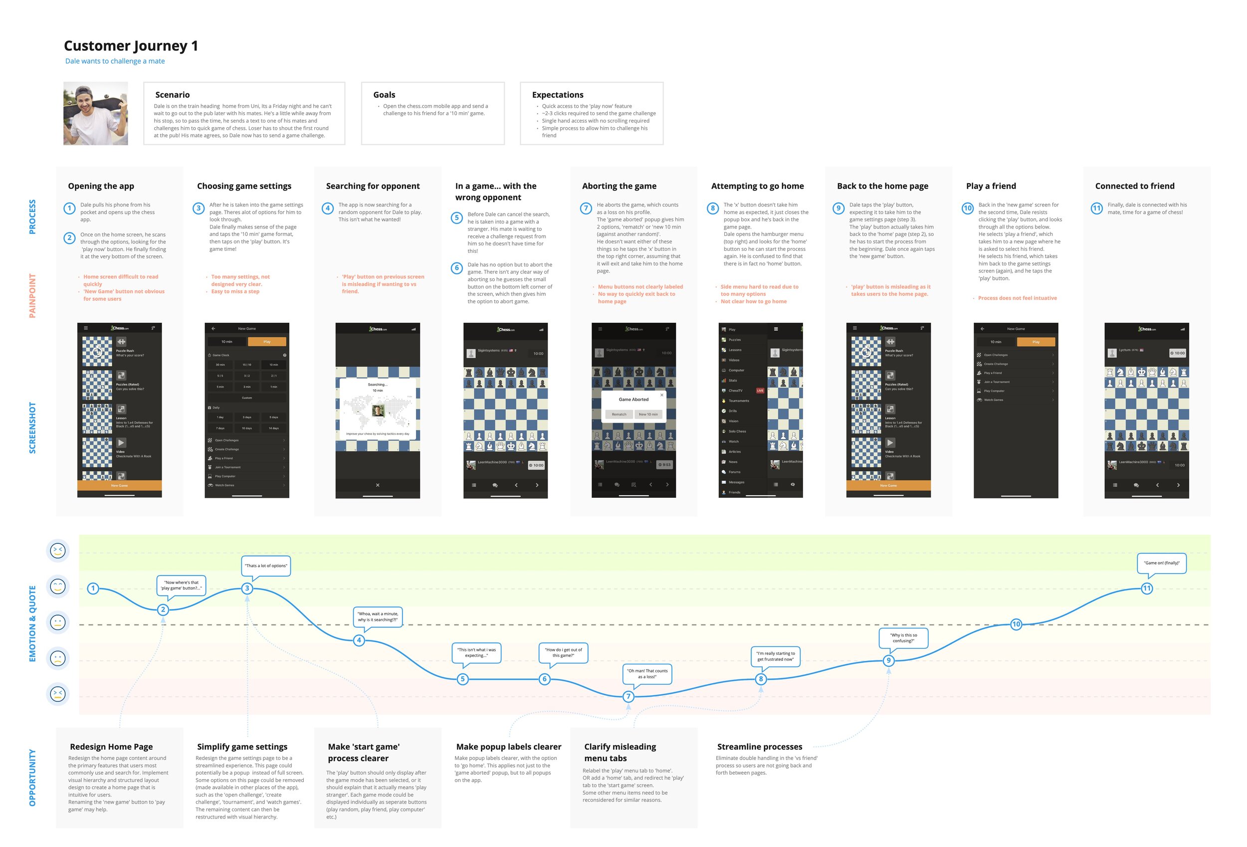
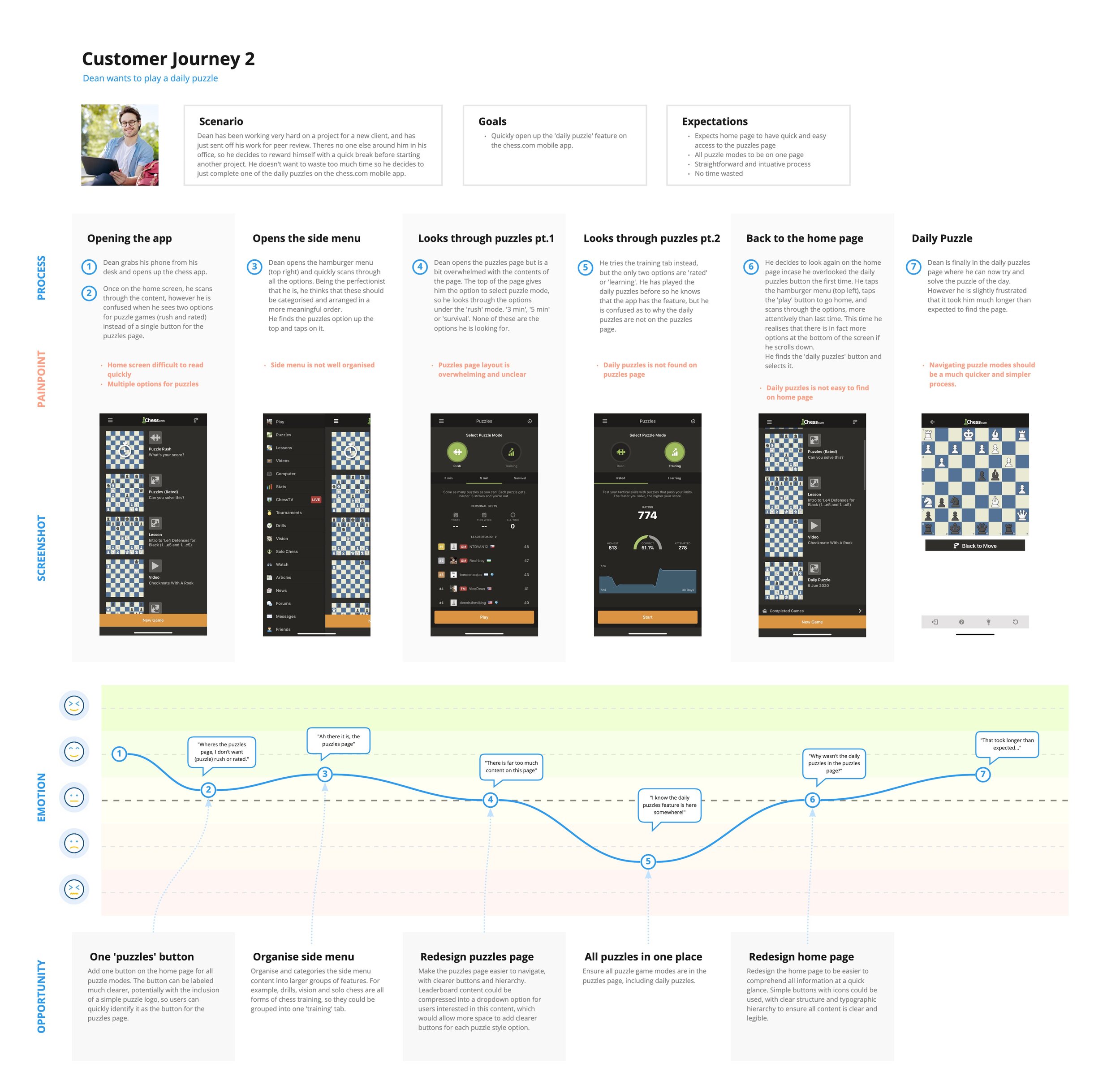
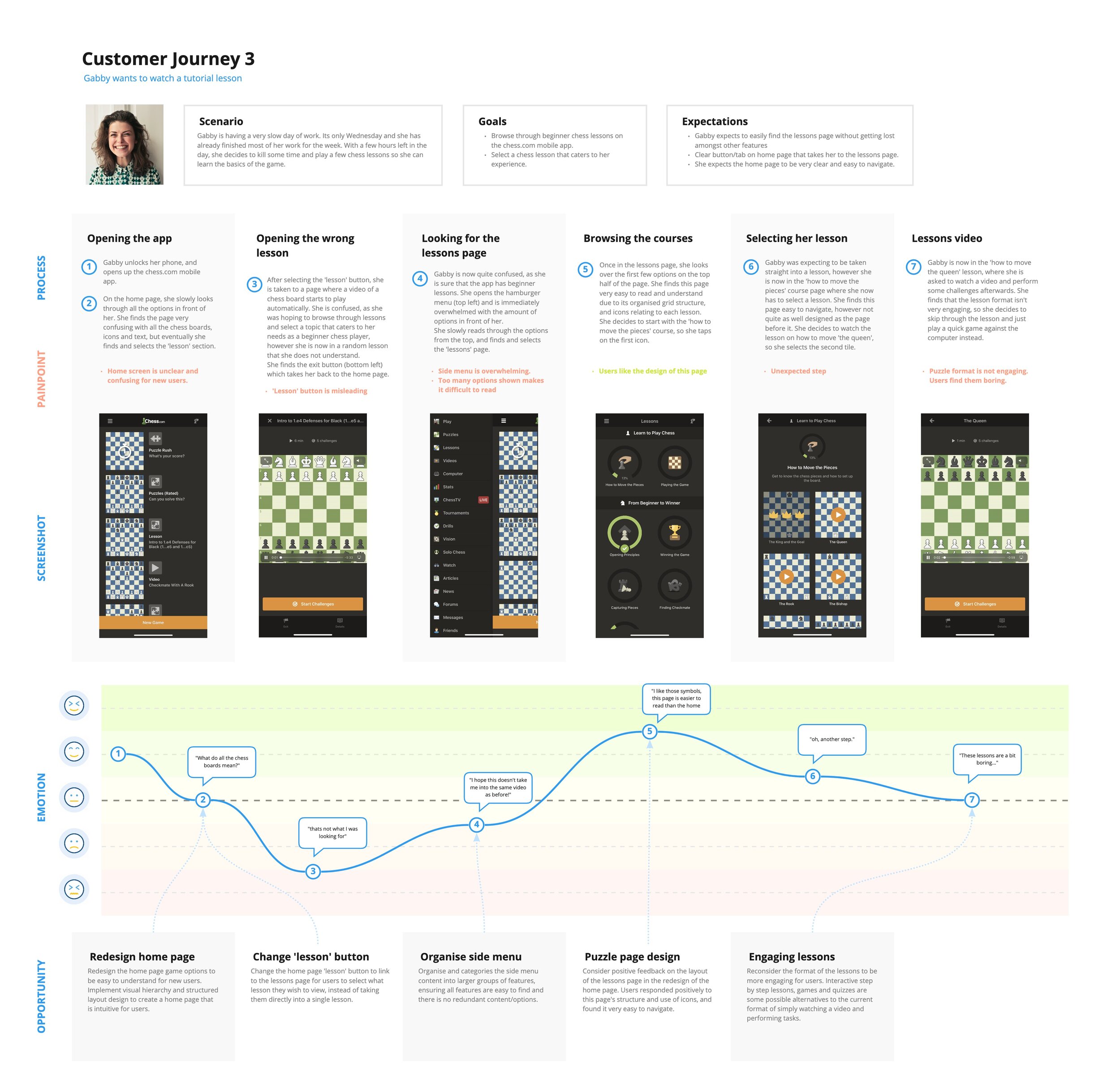
User journey maps were then created for 3 main tasks assosciated with each of the personas. These helped me empathise with the users interactions with the app, identify key painpoints, and potential opportunities that would need to be addressed throughout the design phase of this project.
Identifying Opportunities
An MVP matrix plot was created to map out some potential oportunities or solutions, and determine which ones were both viable and feasable within the scope of this project.
Opportunity #1
Design app around 'play' feature
My design solution must ensure that users will not only be able to easily locate the primary 'play' features, but that it will be the first option they see when opening the app. This will reduce the amount of clicks required of users to access their primary feature, while also allowing them the freedom to explore the other features of the app if they wish.
Opportunity #2
Ensure all buttons, labels and symbols are clear and meaningful
All button labels and section headings are to be relabeled to be clear to eliminae any ambiguity and make the app easier for new users to undersand. A/B Testing is to be conducted to determine which headings and button labels users find clearest.
Symbols are to be refined to be more meaningful to ensure they assist in the users interactions with the app. Some icons from the chess.com website will be used in the new design, and some icons will be redesigned.
Opportunity #3
Categorise all app features into relevent pages
The information architecture must be restructured to ensure that all feautures are categorised into appropriate sections of the app, which will assist in the users ability to browse through the features of the app without getting lost. It will also help in streamlining many of the primary user flows and remove redundant steps going back and forth between pages.
Opportunity #4
Improve app navigation to be intuative and natural
A bottom menu will be added to allow users to quickly navigate between sections of the app based on the revised information architecture and site map. The side menu will also be redesigned to be simpler and easier to browse.
Managing Content
Information Architecture
Current Sitemap:
The next step was to improve the information architecture of the website. I started by illustrating the current sitemap, which allowed me to visualise the ambiguous user flows and disorganisation of conent, before desiging a revised version.
Revised Sitemap:
Based on card sorting exercises, I reorganised and structured the content into their respective categories. This organisation of features would eliminate double handling, improve clarity of the users location in the app, and ensure all features are easily accessible. Grouping content also allows us to reduce the amount of unnecessary options shown on the navigation menus, and on each page, which would eliminate the overwhelming feeling that many users experince when browsing through the app.
User Flows
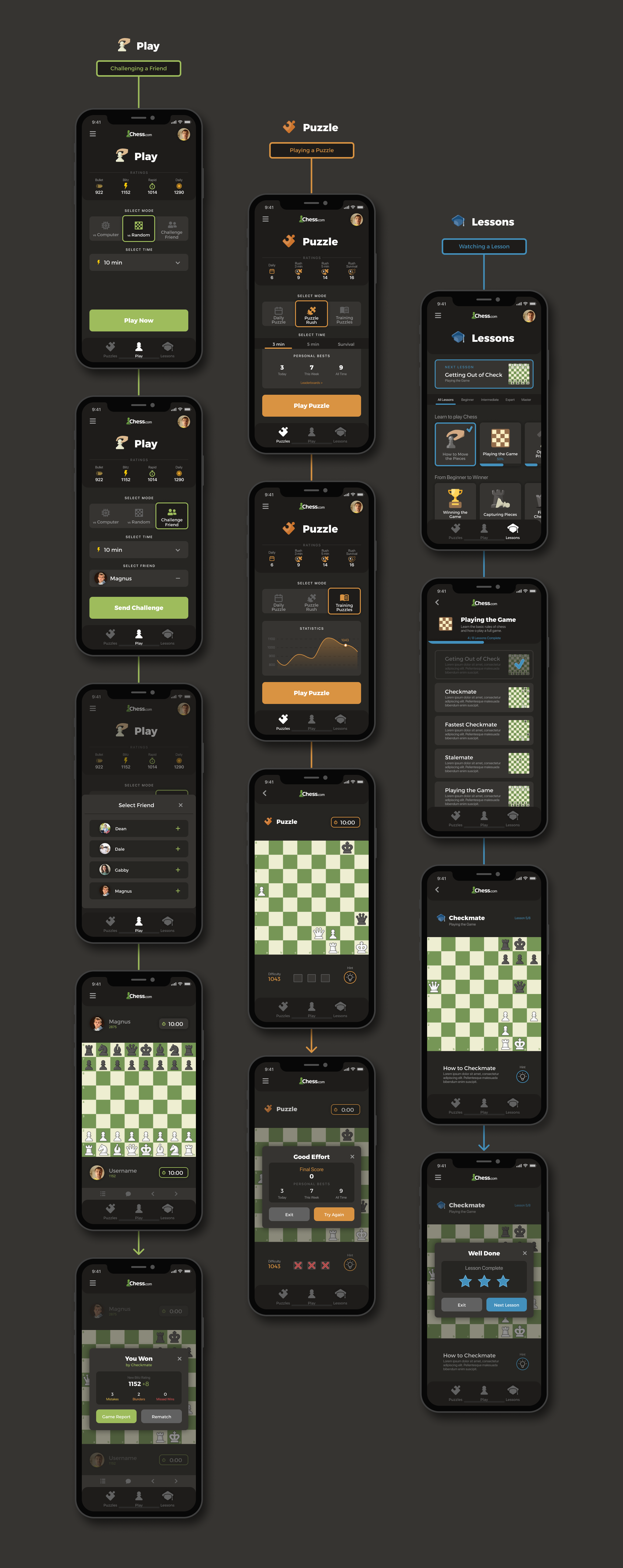
User flows were created for the 3 main user tasks to highlight redundant steps that could easily be removed, and to experiment with some new options that would provide users with a more intuative and streamlined experience. I experimented with a range of sequences that would later be evaluated in usability testing.
Ideation and Conceptualisation
Sketching
Next was Ideation and conceptualisation. I started with sketches, then converted them to low fidelity prototypes that explore diferent ways of implementing hierarchy to help guide users when navigating the app.
Low fidelity prototyping
I created 3 prototypes of the entire app, experimenting with different layouts and sequences tasks required, for example, do users want to select their game mode from large call to action buttons, then be prompted with popup modals to select time and settings, or would they prefer to have all settings displayed from the first step. This balance between quick access vs transparency was one of the many things tested in usability testing.
Usability Testing
To test whether my solutions were successfully solving the navigation problems, I conducted usability testing on 5 participants of various experience levels. Participants were asked to perform 3 tasks on each of the 3 prototypes.
Two of the main objectives of the testing stage was to determine which layouts users found most intuative, and what user flows users found most natural.
Insight #1
New users vs experienced users
Experienced users who were familiar with the content of the app, tended to be more critical of the navigation and flows, which helped me determine the ideal sequence of steps required for tasks such as starting a game.
New users who were not familiar with the existing chess app, were more focused on the component designs, and how easy they were to learn and use, which provided valuable suggesions such as to use slider selectors as opposed to dropdowns, and to label primary buttons so that they help guide the experience.
Insight #2
Task sequencing
When performing tasks, participants tended to prefer to have options displayed before they click the primary start button. Although this wasnt the option with the least clicks required, it did allow users to skip over steps if the default option was what they wanted, which would save them time in the long term. The alternative flow was to select the game mode via large button, then select options via popup windows. This required less clicks, however it was discovered that less popups = a more steamlined process, and for new users, less surprise steps.
Insight #3
Intuative Layouts
I experimented with various content and layouts in each of the 3 task flows to see what users would prefer. Based on feedback, users value consistency in the styles of options across pages (dropdowns vs popups vs sliders), as it allowed them to become acustomed to one style of flow, and apply it across all pages.
On the lessons pages, users prefer horizontal card sliders to select topics, and wide stacked cards when selecting the individual lessons.
Users also liked the 'continue lesson' button, which would allow them to skip the browsing process and pick up where they left off last.
Additional Insights
Additional Insights:
- Users would like the diferent category pages to be diferentiated from one another.
- Users like gamification of progress trackers (specific to lessons page)
- Clear, task specific call to actions - Challenge friend CTA = 'Send Challenge' instead of 'Start Game', Puzzle CTA = 'Start Puzzle' etc.
- Add subheadings/labels above components to provide context to new users.
UI Design
Pattern Library
A style guide and component library was created in order to save time when constructing the high fidelity prototype, and to ensure consistent styling across the entire design. It was important to make sure styling was consistent with the chess.com website, so colours, typography and icons where inspired by the existing designs.
Solution
High Fidelity Design
My solution utilises various visual design principles, combined with the insights gathered throughout this process, to help solve the problems that users had with navigating through the app, and being able to quickly locate their desired features.
Benchmark testing
I conducted 4 benchmark tests to verify whether my design was successful in solving the problems highlighted earlier. When comparing my design to the previous app design, all 4 participants were able to verify that it was easier to use, and much more intuative.


